You would think that it is a relatively simple task to make a phenolic tag, right?
- You have your phenolic plastic.
- You have the right equipment for the job.
- You have the requirements which tell you what size and color the tag should be.
- The requirements clearly tell you what size and type of font to use.
Sometimes it is just that easy, and sometimes satisfying a job’s compliance requirements require a little creativity.
Tag Specs: The Ideal Scenario
In an ideal scenario, tag requirements contemplate the following items:
• The number of lines of text to be engraved
• The size of the text
• Reasonable spacing between lines
• The amount of distance from the engraved area to the edges
We use a few “rules of thumb” to ensure a high-quality product:
• Starting with the obvious, center all lines on the tag unless otherwise specified
• Keep the text ¼” away from both the vertical and horizontal edges
• Ensure 1/8” distance between each line of text
The Reality
The person who writes the nameplate identification specifications for the job is, often, nowhere near the job sight. They don’t always know how much space is available in the job environment, or how many characters need to go on the tag for proper identification. What do we do when that occurs? We start by raising our hand and asking if there is any flexibility in either the size of the tag, size of the font, or both. In the absence of flexibility, we get creative. That’s where the art comes in, but it isn’t rocket science(see what I did, there?). We “bend” the engraving while operating within the given guidelines.
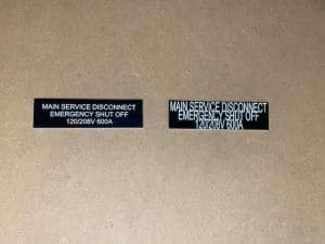
How do we do this? Thanks to today’s graphic arts programs, like Adobe Illustrator or Corel Draw, we can subtly stretch, shrink, or squish the text in barely perceptible ways that still result in a clean look but fit within the job’s parameters. As examples, for every two lines of text, we can “steal” about 1/16” vertically. Not much, but every little bit makes a difference. When it comes to the length of the engraved area, we can squish the letters to gain approximately 25% additional engraving surface area. These two, simple techniques typically get us to where we need to be.
Good Versus Bad
Check out our photo gallery for examples of what a high-quality product looks like and see below for a comparison of high versus compromised quality.